Designing the Agentic Analytics Growth Journey
Repositioning GoodData as GoodData.ai, without losing the analytics buyer journey people already trusted.
- RoleSenior UX Designer, Growth
- ClientGoodData
- IndustryAnalytics · B2B SaaS
- Year2024
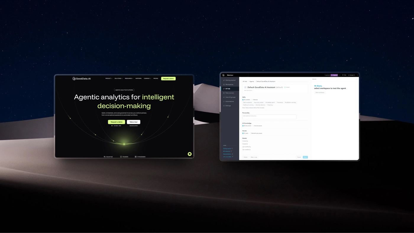
I led growth UX for GoodData's repositioning as GoodData.ai, owning the user journey with a clearer two-path journey across AI-Driven BI and Agentic Analytics in growth surfaces.
Overview
We translated a major product and brand shift into a clearer, conversion-focused digital journey.
We introduced Agentic Analytics without weakening the BI journey buyers already trusted, then carry that promise into the trial and sales funnel.
Higher
Contact us conversions, pricing-page H1 test
2
Buyer paths, from a sprawling product menu
6
Surfaces redesigned in a phased rollout
The goal
The journey presented too many capabilities without hierarchy, while the new agentic positioning risked breaking once buyers entered the trial.
We needed to create two clear acquisition paths and align the trial experience.
Selling agentic AI is a translation problem. Buyers don't want a chatbot, they want trust that an autonomous workflow won't embarrass them in a board meeting.
What I owned
UX end to end. I cooperated closely with Enterprise Sales, Product Marketing, Demand Generation and the enterprise-product UX designers to carry the story into the trial.
Information architecture
Restructured acquisition around AI-Driven BI and Agentic Analytics, validated through card sorting and buyer research.
UX Research and Flow
Aligned pages, demo and contact flows, clarified the pricing narrative and ran the H1 test that increased conversions significantly higher.
Trial activation (partnered)
Designed first-run experiences with product UX to help users reach their first insight faster.
Growth loops (partnered)
Contributed to upgrade prompts, feature gating and usage limits that moved active trials toward paid plans.
Running quantitative analysis: diagnosing the funnel before redesigning it
Before making structural changes, I aligned stakeholders around the funnel's current state and audited its health using web analytics and session replay.
I mapped the highest-intent pages, conversion paths and drop-off points, then combined the quantitative findings with stakeholder input to identify constraints, risks and opportunities.
I also audited product analytics to understand the trial's first-touch events and intent signals, to talk to sales and have a point of comparison before and after the change.
This established the evidence base for the information architecture and pricing decisions that followed.
From a portfolio menu to two validated offerings
The old menu placed BI, Analytics Lake, Analytics as Code, AI Assistant and Embedded Analytics at the same level, with Product Overview adding another decision layer.
We used internal card sorting to align teams, then tested the structure externally with buyer personas. The research helped separate product strategy from how buyers understood the portfolio.
The result was a two-offering model carried across navigation and homepage: AI Assistant moved under Agentic Analytics, Embedded Analytics remained under AI-Driven BI, and Security & Compliance became a global trust layer rather than a product item.
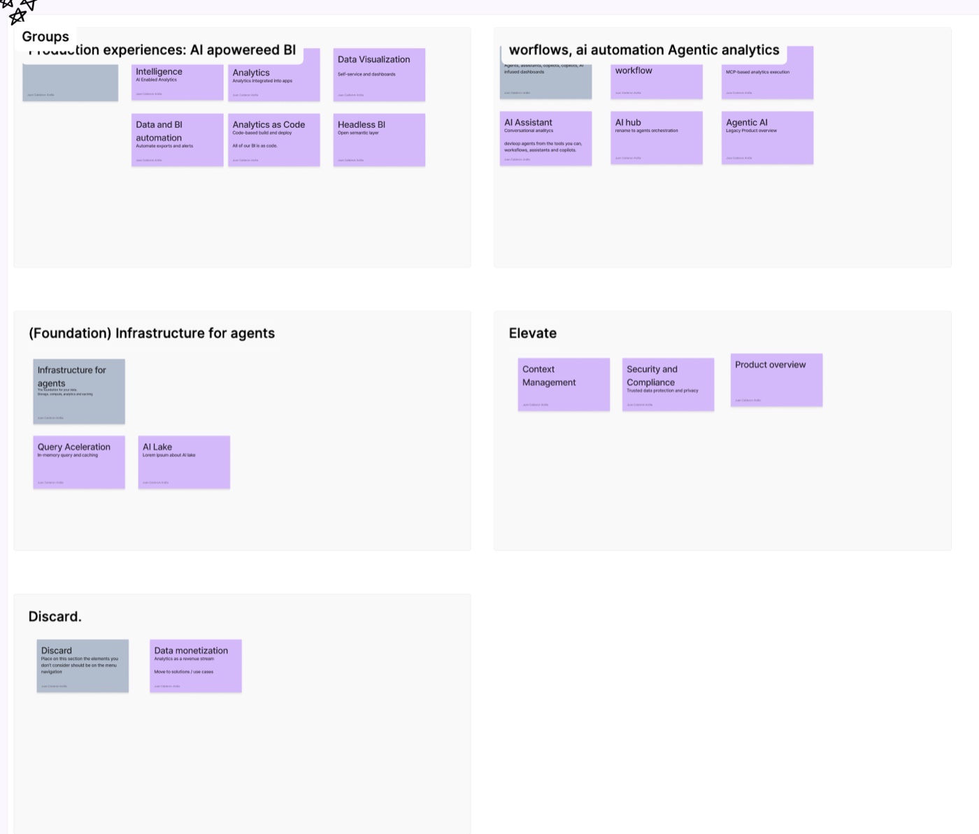
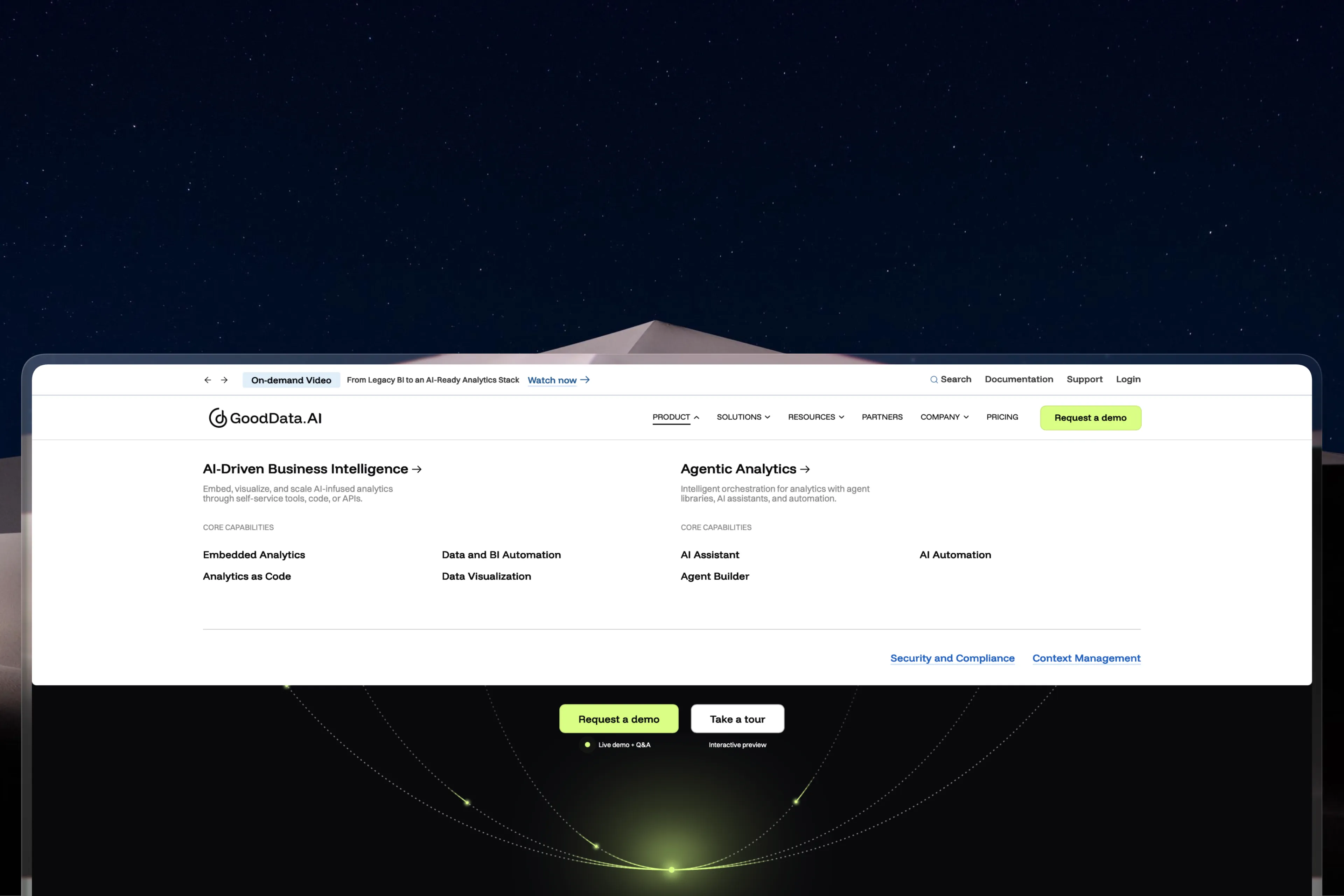
Navigation redesign: a validated two-offering model replacing the portfolio-style menu.
Trade-off
We finalized the structure before every visual detail was resolved, shipping once the model tested well and refining consistency after launch.
Usability testing and A/B tests on pricing: keeping "analytics" explicit
I rebuilt the pricing page around scannability. Three plan categories, a comparison table built for quick reading, and a clear hierarchy between plan name, price, and capability. I designed the table component, the plan cards, and the responsive layout for narrow screens.
One decision needed proof rather than taste. Buyers anchor on the word analytics, so my hypothesis was that an analytics-led headline would convert better than an AI-led one. I designed both versions, set up the A/B test, and ran them against each other on live traffic. The analytics-led version won clearly, so it shipped.
Agentic AI created interest, but analytics remained the clearest signal of product value, category and buying intent.
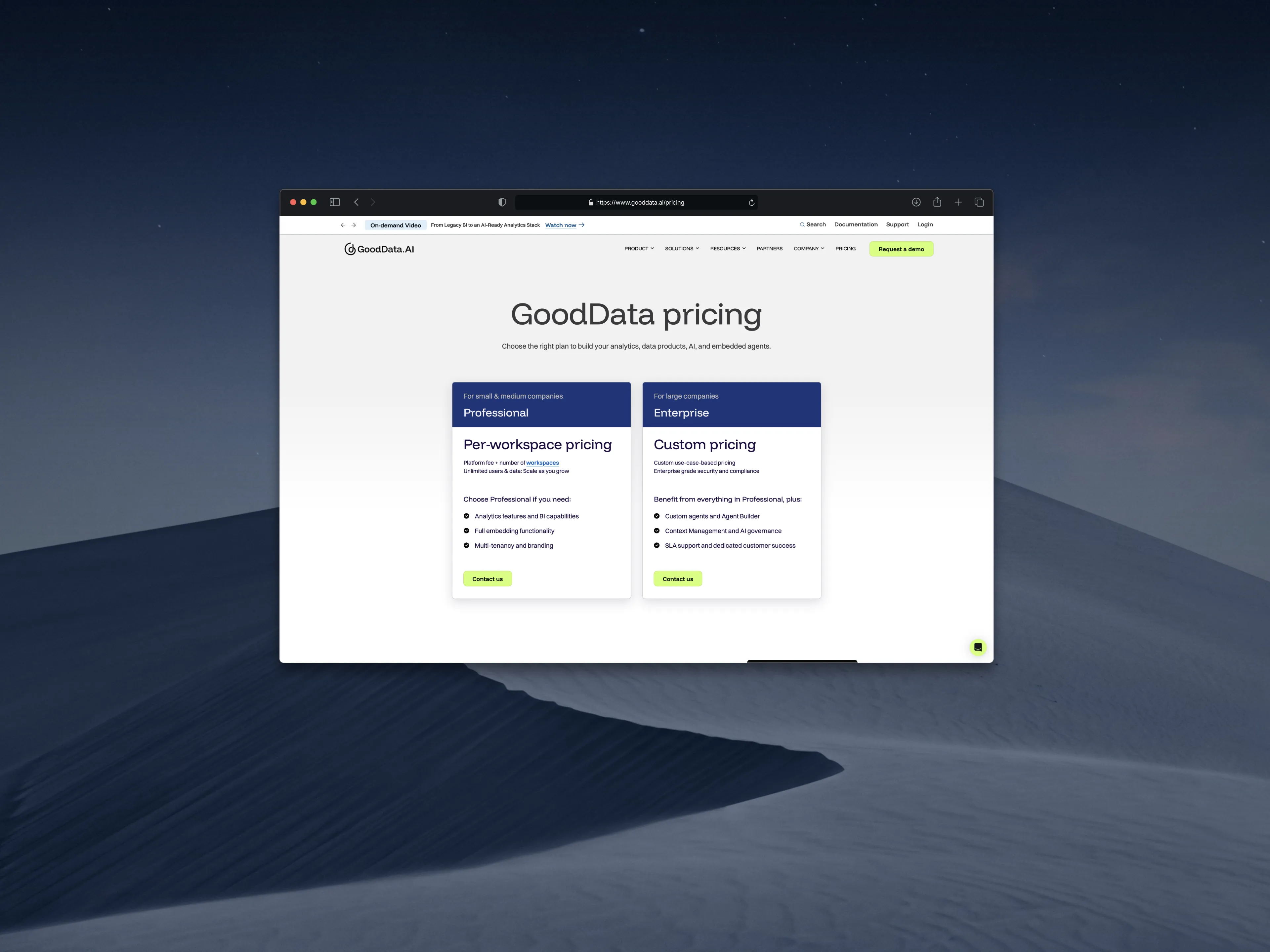
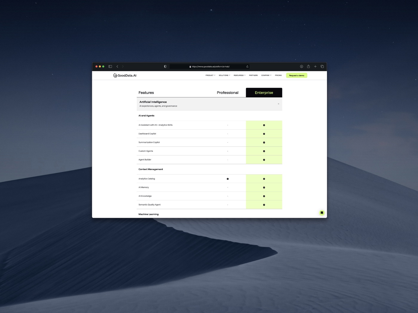
Pricing restructured around the way buyers understood and compared the offering.
Separate the category page from the conversion page
Explaining a new category and driving one specific action are different jobs. The Agentic Analytics page became the category pillar, teaching the offering and its capabilities.
The Agent Builder page became the conversion surface, focused on how to build and deploy governed AI agents with control.
 Open live site ↗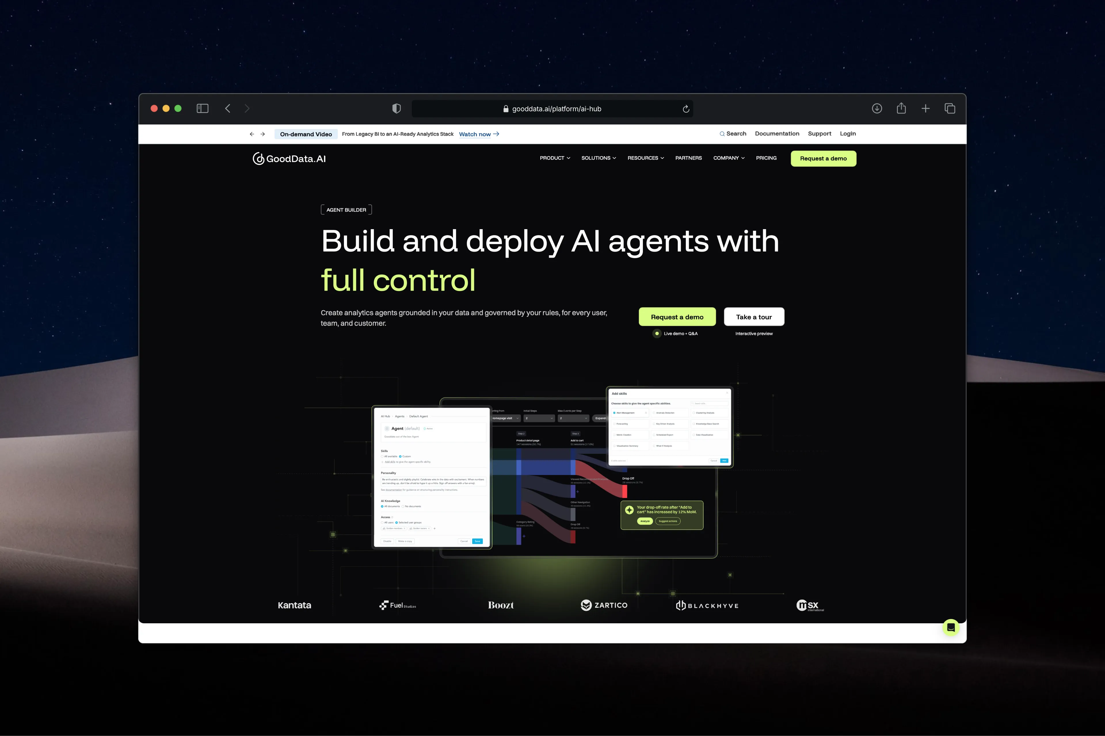
Agentic Analytics is the category pillar; Agent Builder is the conversion-focused surface for governed AI agents.
Trade-off
More surfaces to maintain, but a cleaner funnel: understand the category first, then move to a focused capability page when closer to action.
From sign-up to first insight
The strongest predictor of whether a trial converted was simple: did the user reach a real insight in their first session. So I designed the first run around that single outcome.
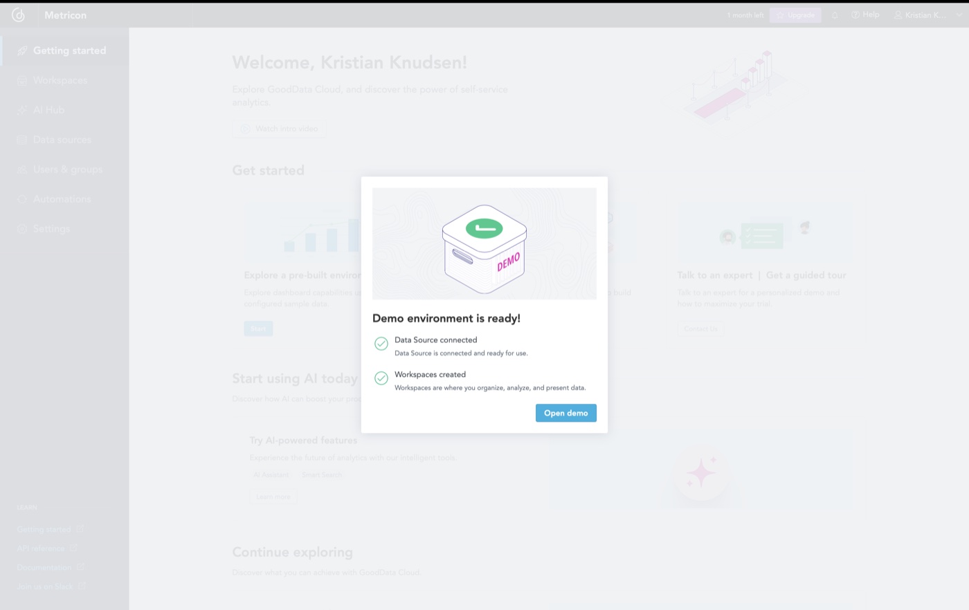
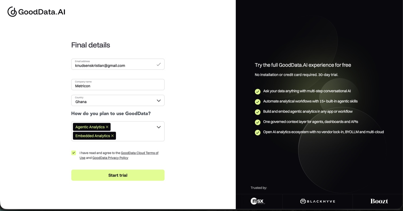
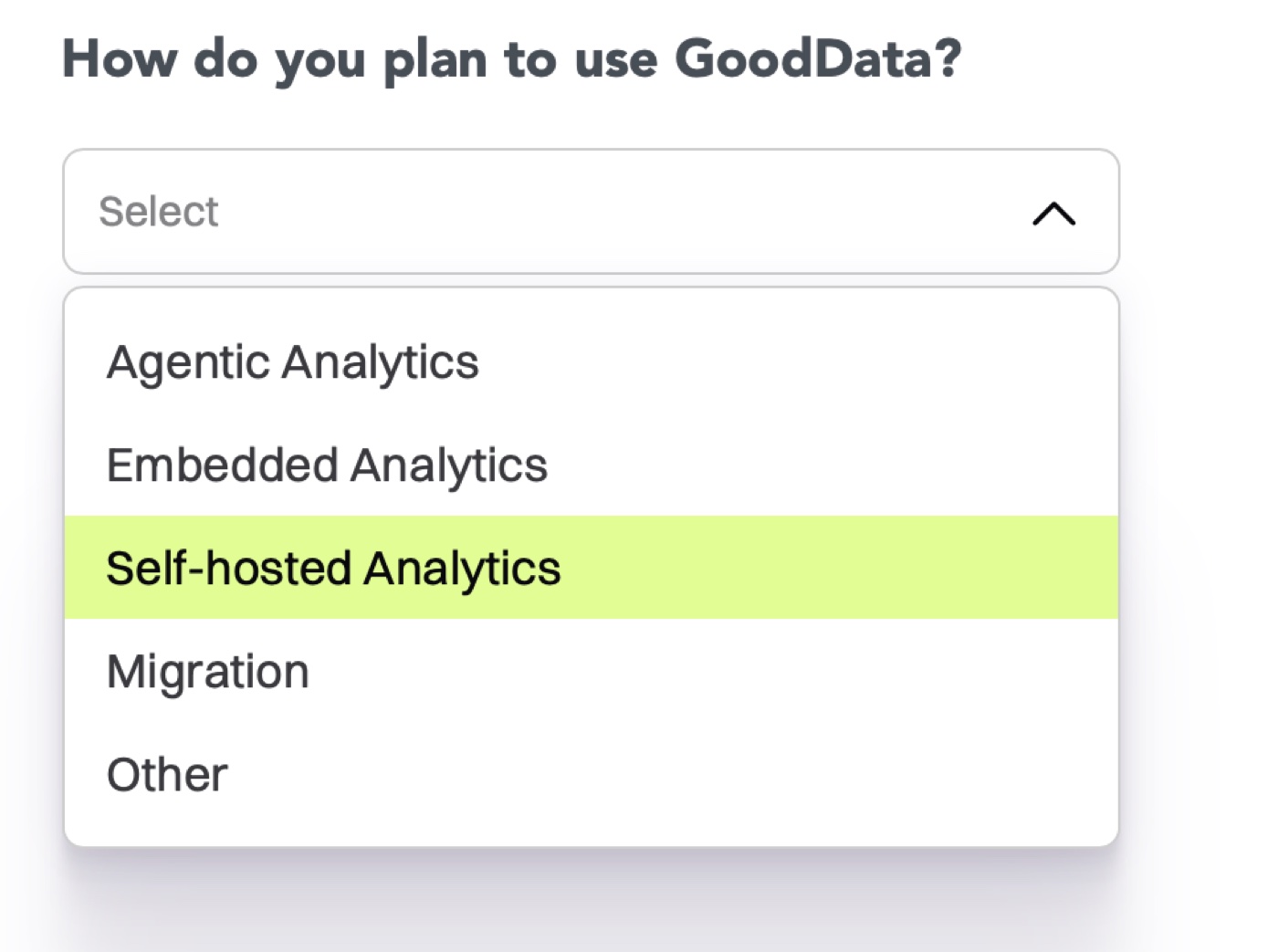
We updated the trial signup to reflect the new capabilities.
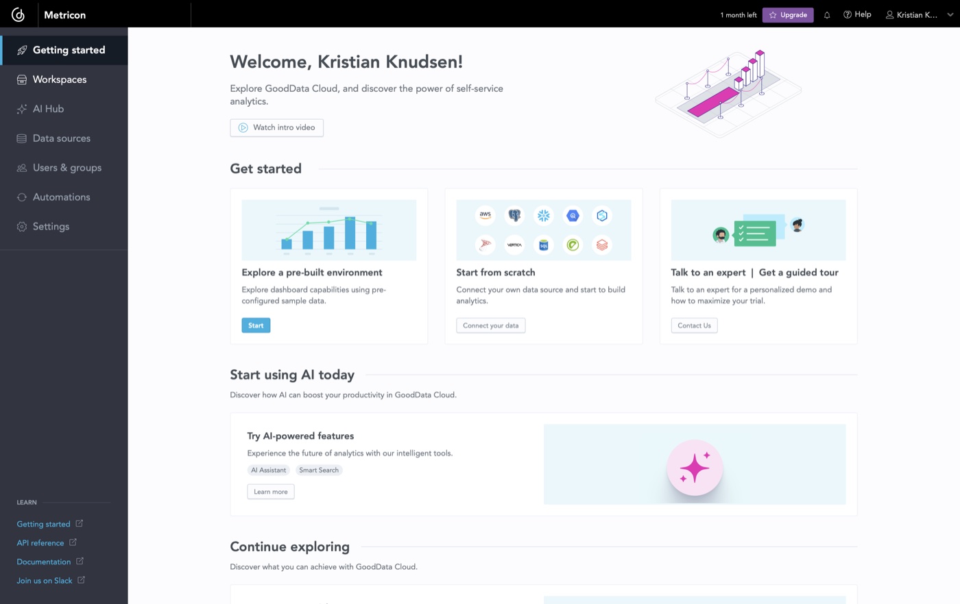
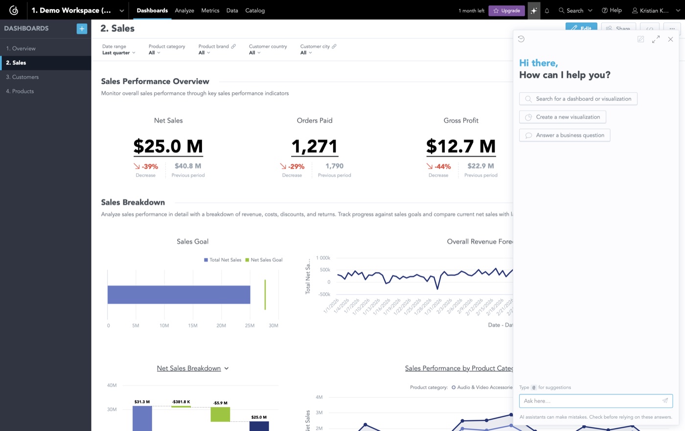
The signup flow asks for a goal up front. Inside the workspace, the assistant sits next to live dashboards and offers concrete first steps as tappable suggestions: search a dashboard, create a visualization, answer a business question. The first screen is never empty. I tracked whether users reached that first insight and used it as the signal for whether the design was working.
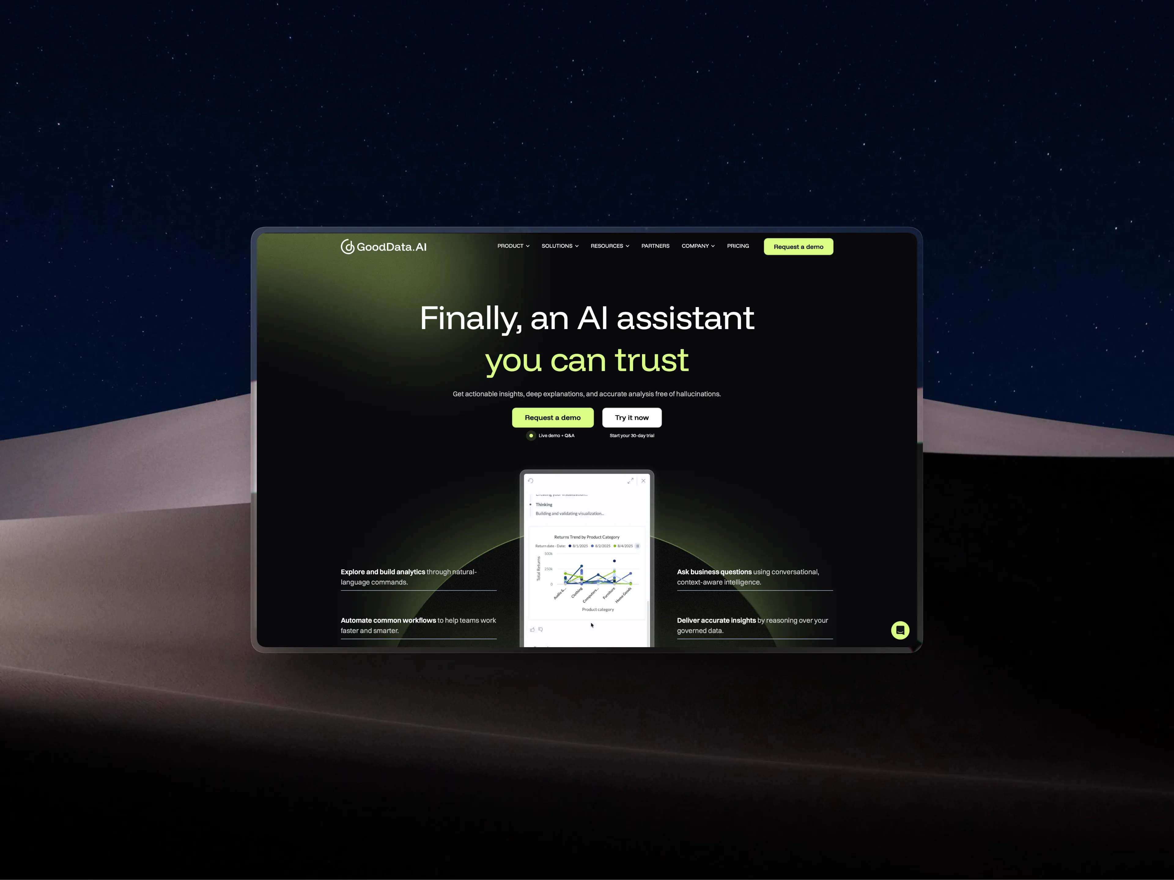
The marketing screenshot and the real screenshot should be the same screenshot.
AI Assistant
We perform design critiques, usability testing and iterated to update the activation loops on the AI Assistant, primarily the started prompts chips.
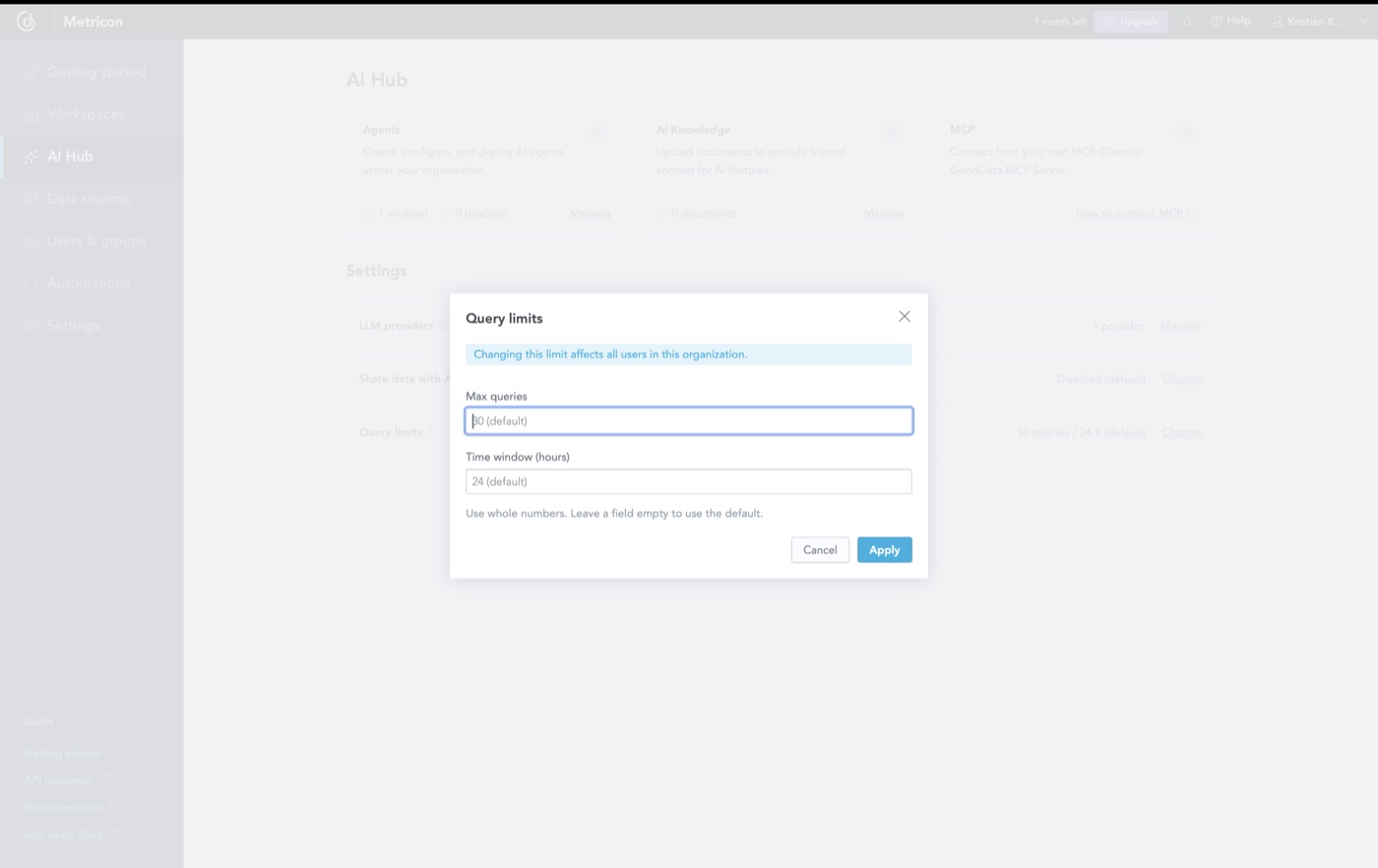
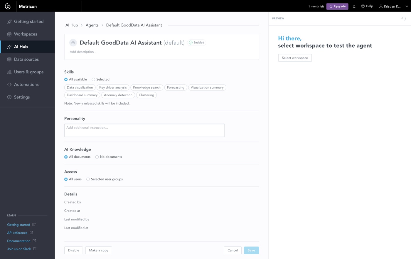
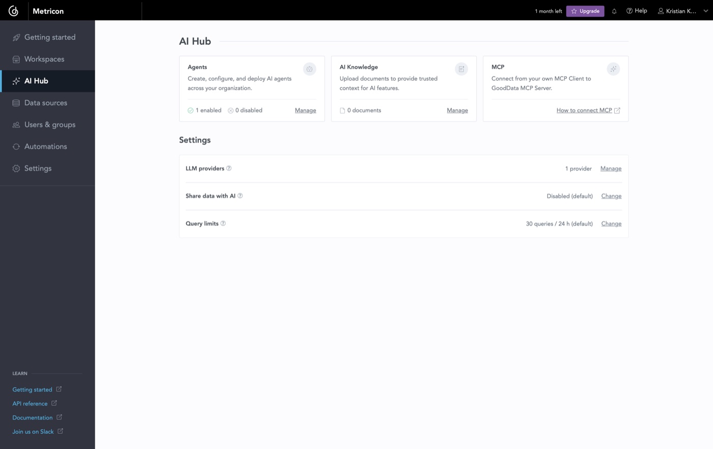
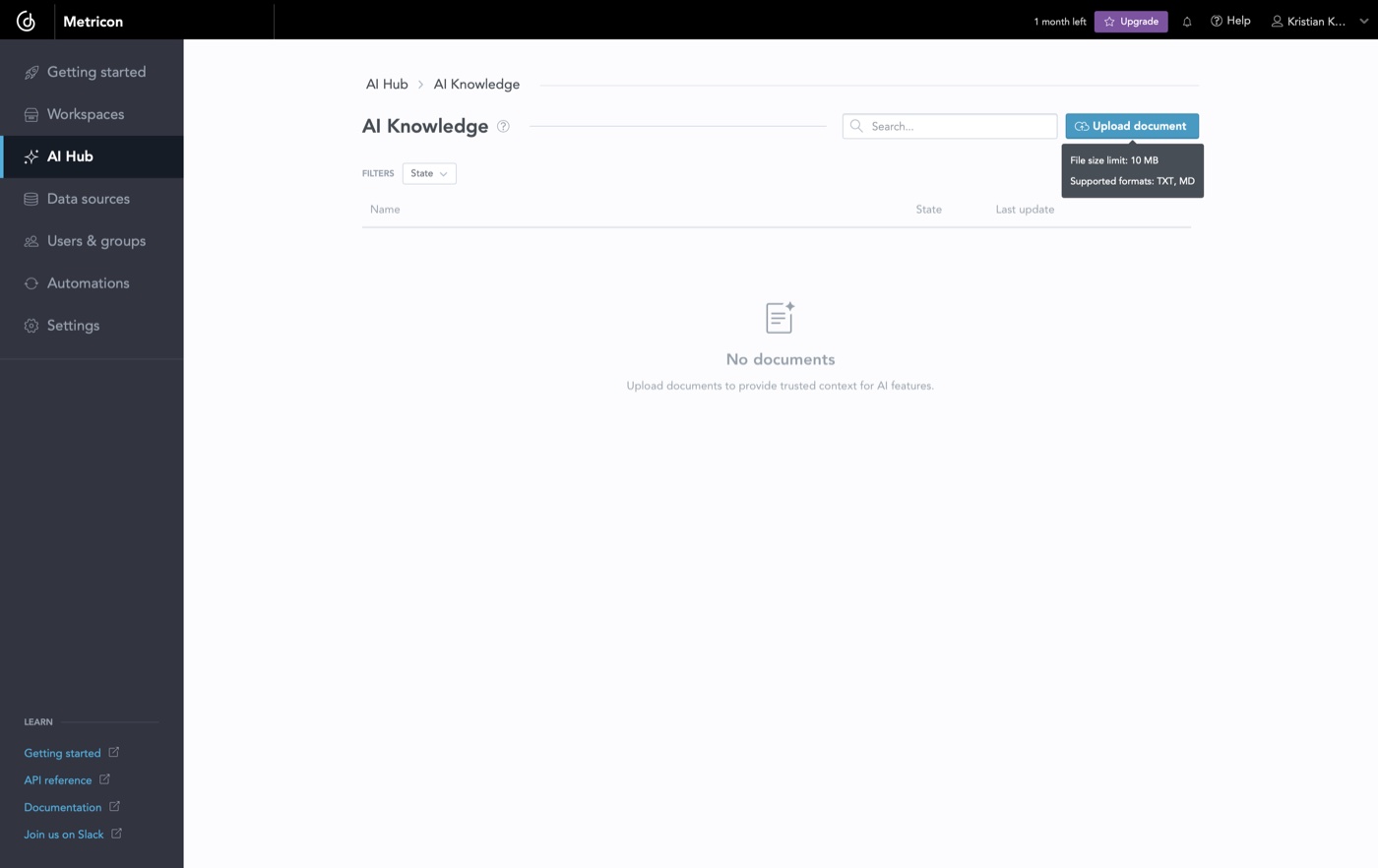
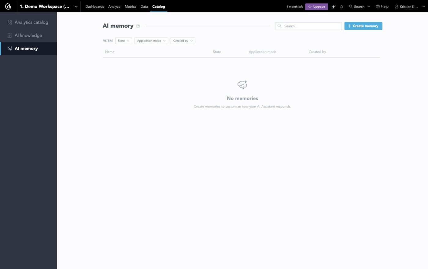
AI Hub and Agent Builder on trial
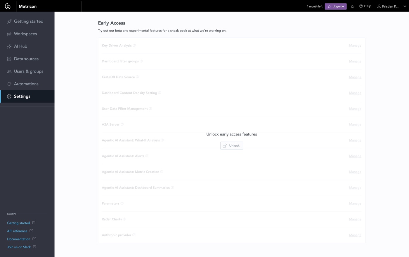
AI Hub and Skills Configuration sit at the admin/org level of the trial, where AI memory and knowledge in the workspace experience.
Growth loops built into the trial
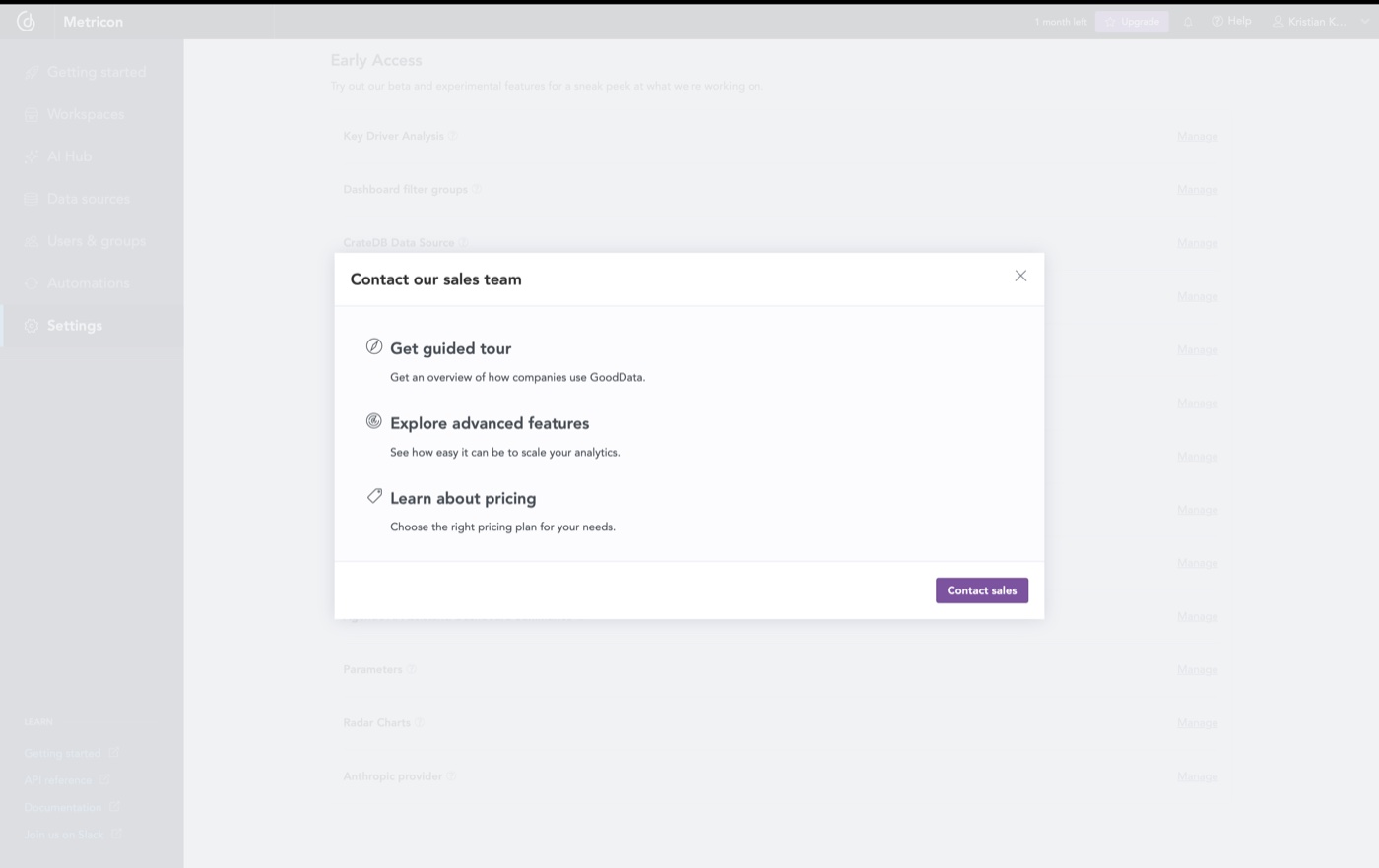
The trial wasn't just a demo, it was a signal surface. We designed the upgrade moment to show up where users felt the ceiling, not as a generic paywall.
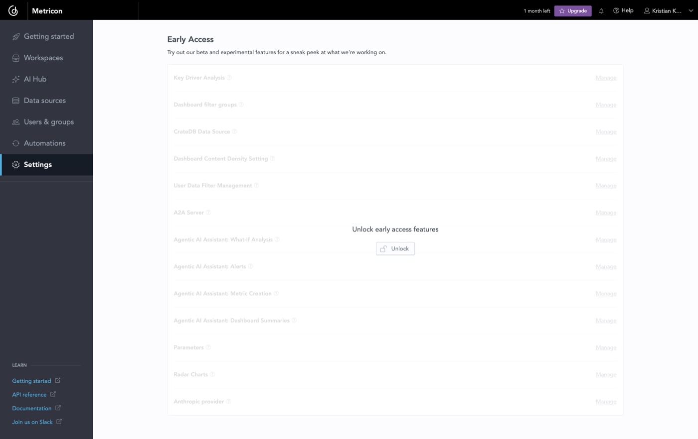
When a user reached a limit or a gated capability, a contextual component explained the value in place and kept the next step one tap away, while the core experience stayed fully usable. I watched how each moment performed and adjusted the ones that felt too aggressive or went ignored, so the upgrade landed when a user felt the ceiling rather than before.
Trade-off
Gating risks frustrating trial users if it's too aggressive. We gated advanced agentic features while keeping the core insight loop fully usable, so the upgrade felt earned, not forced.
Rolled out to reduce journey risk
Changing everything at once risked broken paths and inconsistent messaging, so we shipped in stages: navigation, homepage, Agent Builder, Agentic Analytics, pricing, then supporting pages.
Navigation came first because it defined the architecture, if users couldn't grasp the structure, nothing downstream would land.
Trade-off
Some surfaces were temporarily more aligned than others. We accepted that to validate the structure and ship the highest-impact changes first.