Digital Product Passports
A two-sided SaaS platform that helps skincare brands publish trusted product information, and gives shoppers a clearer way to understand what they scan.
- RoleLead Product Designer
- ClientProduct ID · Skincare brands
- IndustryB2B SaaS · Retail · DPP
- Year2024
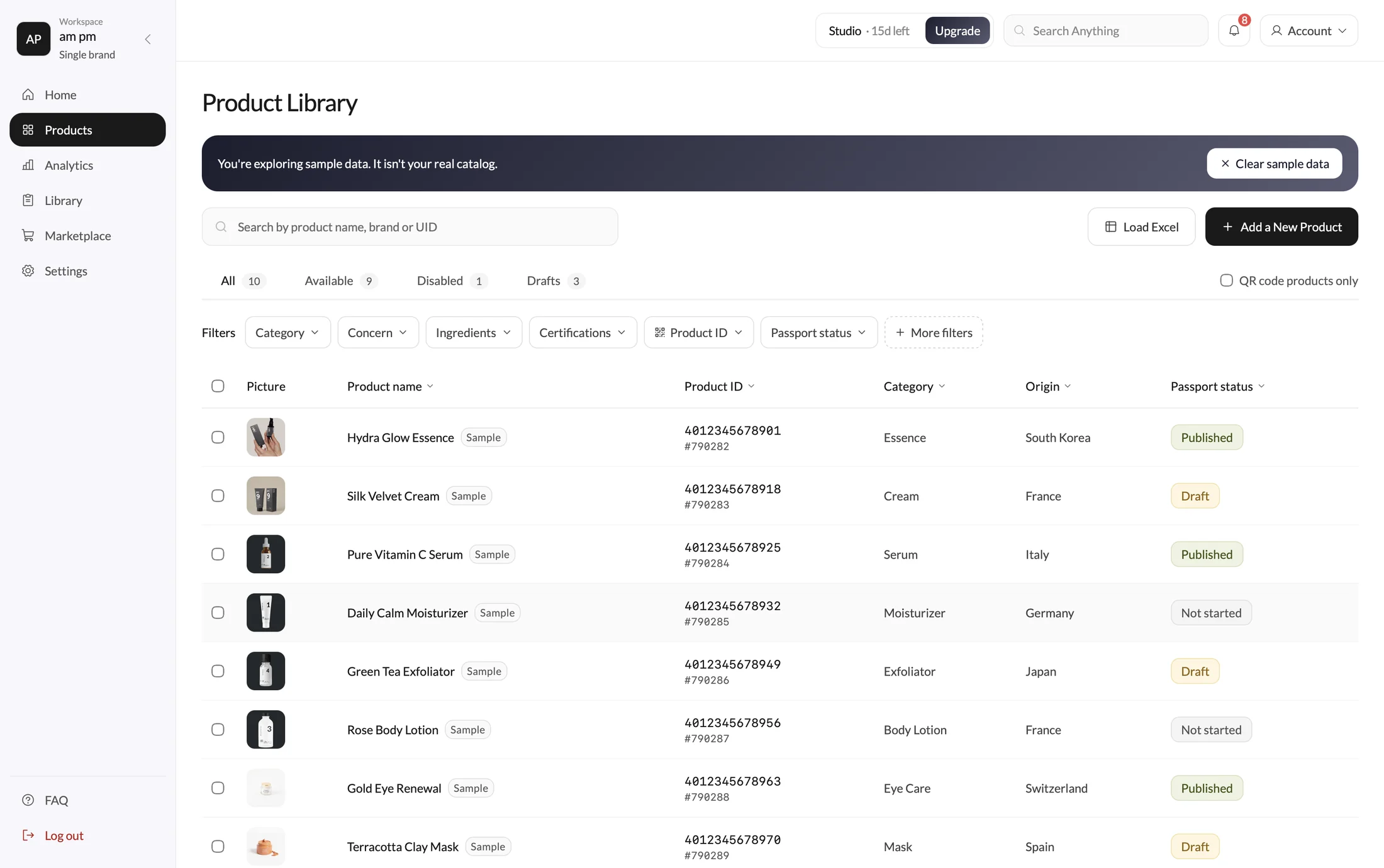
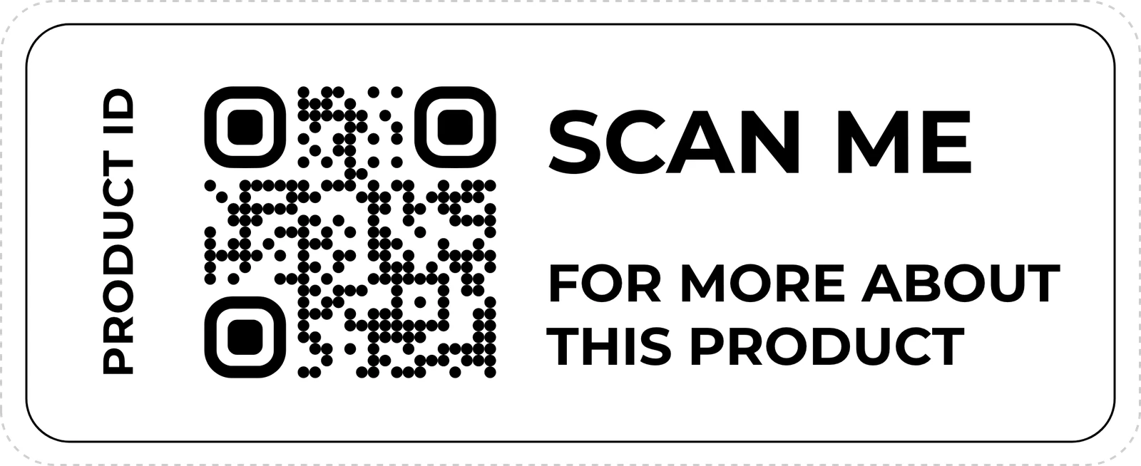
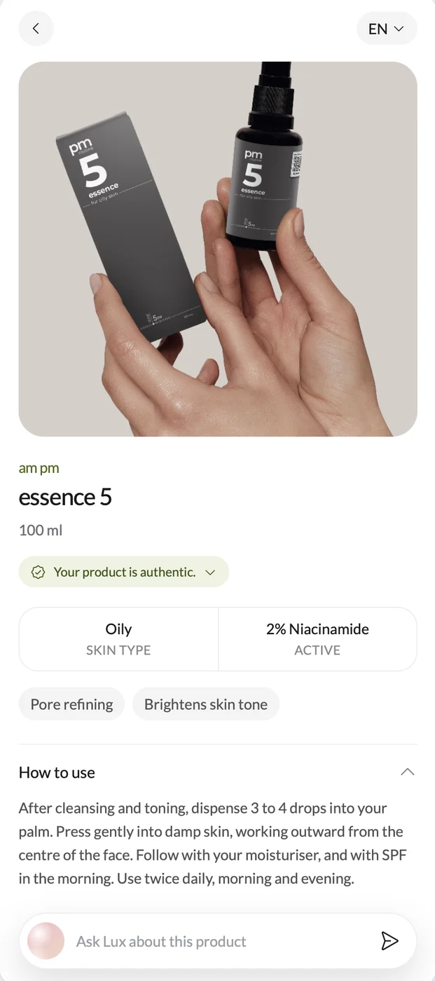
A QR opened a page, not brand’s product understanding.
Compliance created urgency but usefulness created adoption.
The regulation explained why the product might be needed. It did not explain why teams would use it now.
My contribution
I owned product design and UX across the brand workspace and the mobile passport, from research and service mapping through interaction design, prototyping and implementation QA.
- Research across shoppers, brands and retailers, with scan-to-answer tasks
- Mapped the full workflow, from a brand signing up to a shopper scanning the QR, so setup, publishing and daily catalog work stayed one connected system
- Mobile-first interaction design, responsive behavior, content hierarchy, states and edge cases
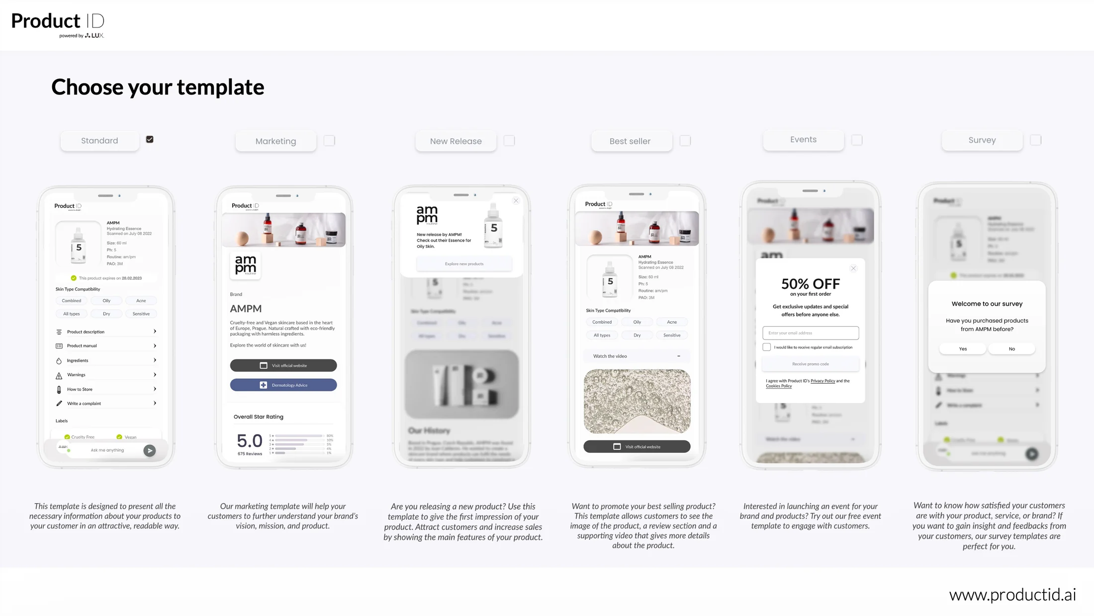
- Took the patterns we kept rebuilding by hand for individual clients and turned them into a set of reusable blocks brand teams could pick from
- Specifications and QA with engineering, including accessibility, performance and responsive checks
Team
 Product designer (me)
- Squad member
- Squad member
- Two more squad members
We worked in squads. Mine was a product manager, two back-end developers, one front-end developer, and me as the product designer across both surfaces.
Some squads also had a UI designer supporting the system, and the CEO contributed directly to the product.
Brand and retailer partners grounded the backstage workflow. Customer testing grounded the mobile experience.
Every passport was built by hand, one client at a time.
Before the console existed, each client's product pages were assembled manually. It partially worked, but it did not scale. The same requests kept coming back: brand story, sustainability, authenticity, recommendations, commerce.
The work was to move that into a system brand teams could run themselves, without giving shoppers a worse page on the other end.
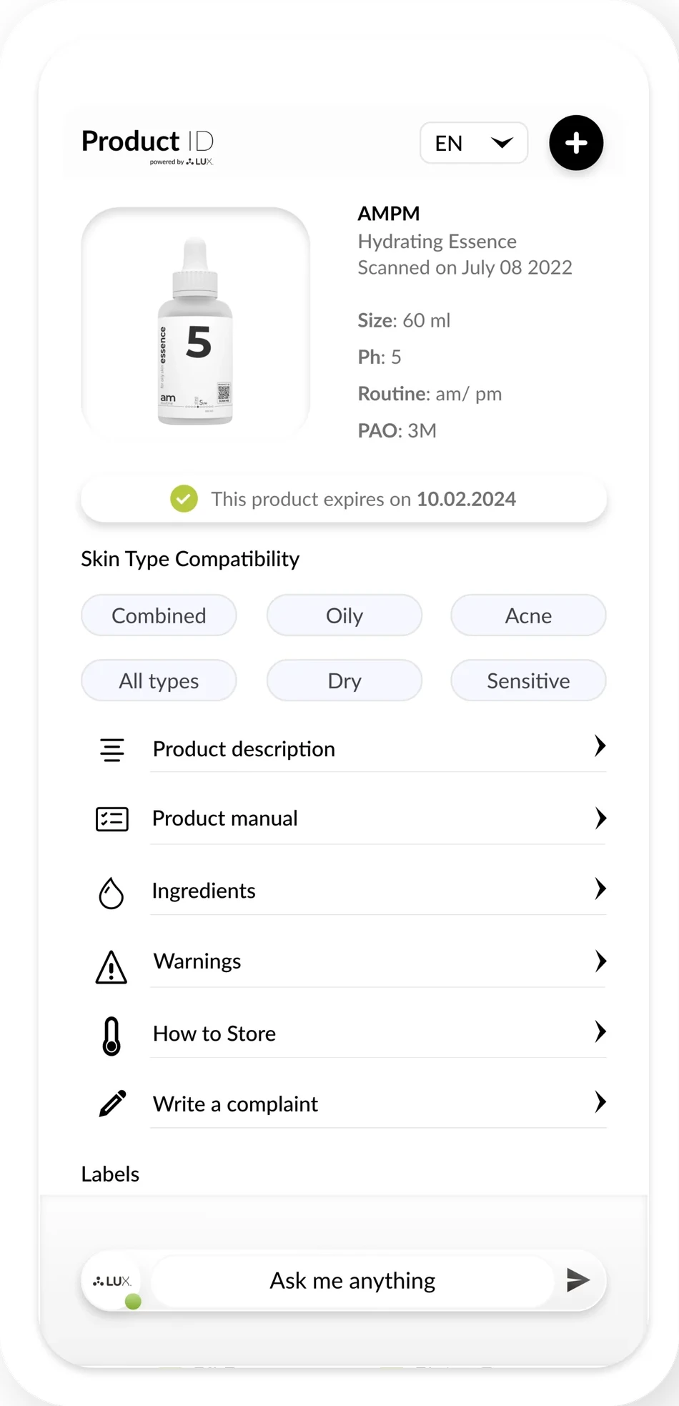
First user: the Scanning Shopper

Primary
The Scanning Shopper
Standing in a store or bathroom, comparing an unfamiliar product against a personal need.
One hand on the product. Tell me what this is and whether it is for me.
- Wants
- Identity, suitability, usage and evidence in seconds
- Blocked by
- Dense pages, promotional content and technical language
- Drove
- Mobile hierarchy, performance and progressive disclosure
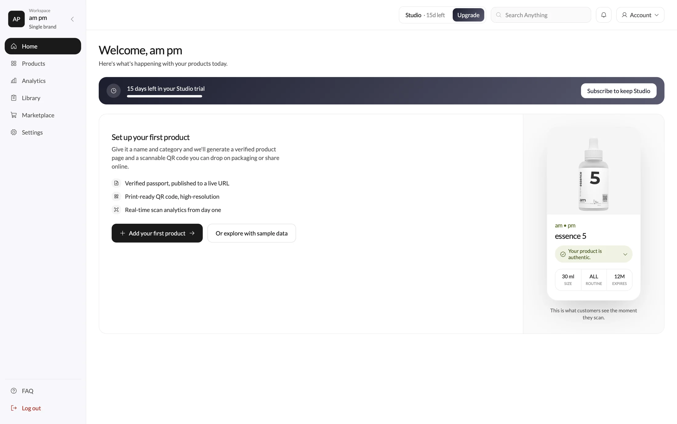
Second user: the Catalog Operator

Secondary
The Catalog Operator
Owns product information across multiple tools and needs a reliable way to publish at scale.
Let me enter it once. Show me what customers will see.
- Wants
- A clear record, mobile preview, publication state and QR
- Blocked by
- Fragmented data, unclear ownership and repeated manual work
- Drove
- Structured records, permissions, publication state, version history, bulk actions and live preview
Process
Five questions that shaped the passport.
Each decision came with its evidence, and the evidence is what kept the arguments short.
- Open immediately in the mobile web. The strongest moment of intent happens directly after scanning packaging; an install or account gate would interrupt it.
- Identity, authenticity and the highest-value answer. Interviews, dogfooding and moderated sessions repeatedly surfaced counterfeit anxiety and the need to confirm the scan resolved to the right item.
- Summaries first, source data one step away. A mobile page has limited space, while certificates, provenance and ingredient data can be extensive.
- Conversation handles the long tail, not the basics. A chat-first interface was flexible but slower and less predictable for ingredients, claims and other expected questions.
- Constrain the structure; configure the value. The same requests kept coming back across clients, so the patterns were real. But when brands got a blank canvas, every passport looked different and nothing was auditable.
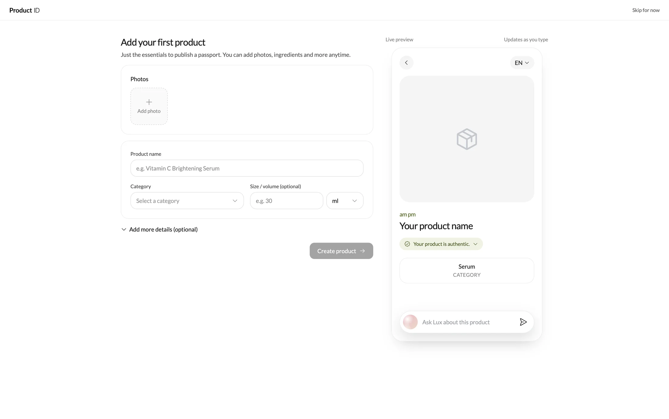
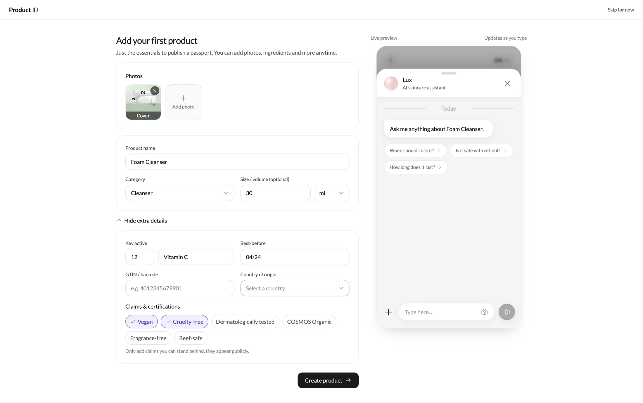
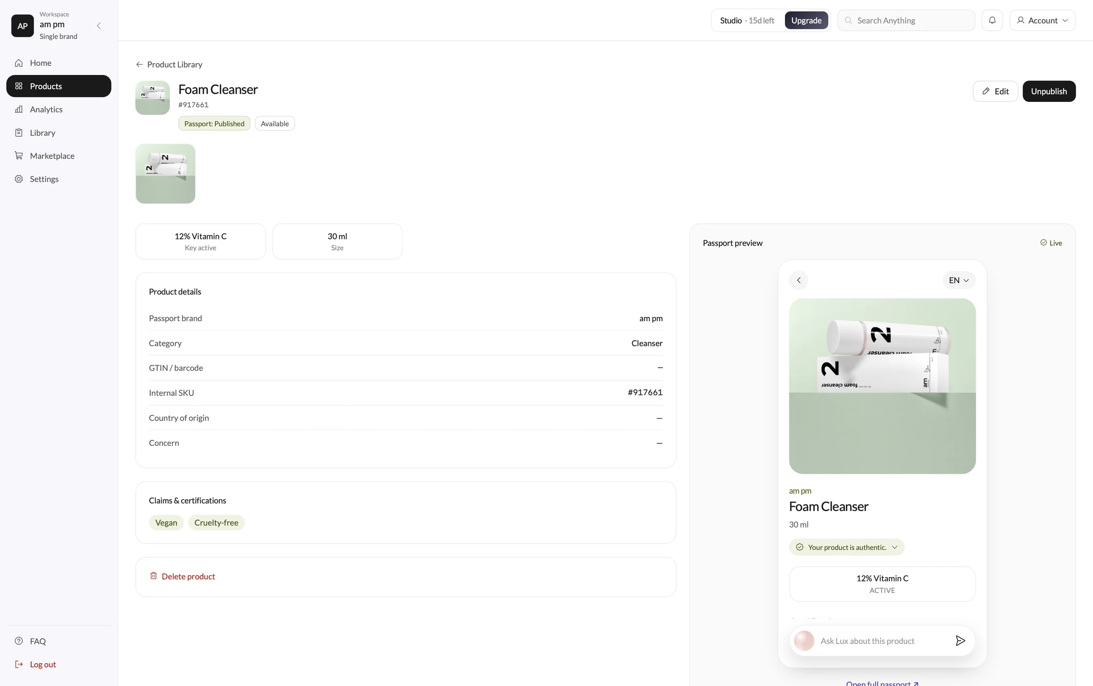
For brands, the first session ends with something usable
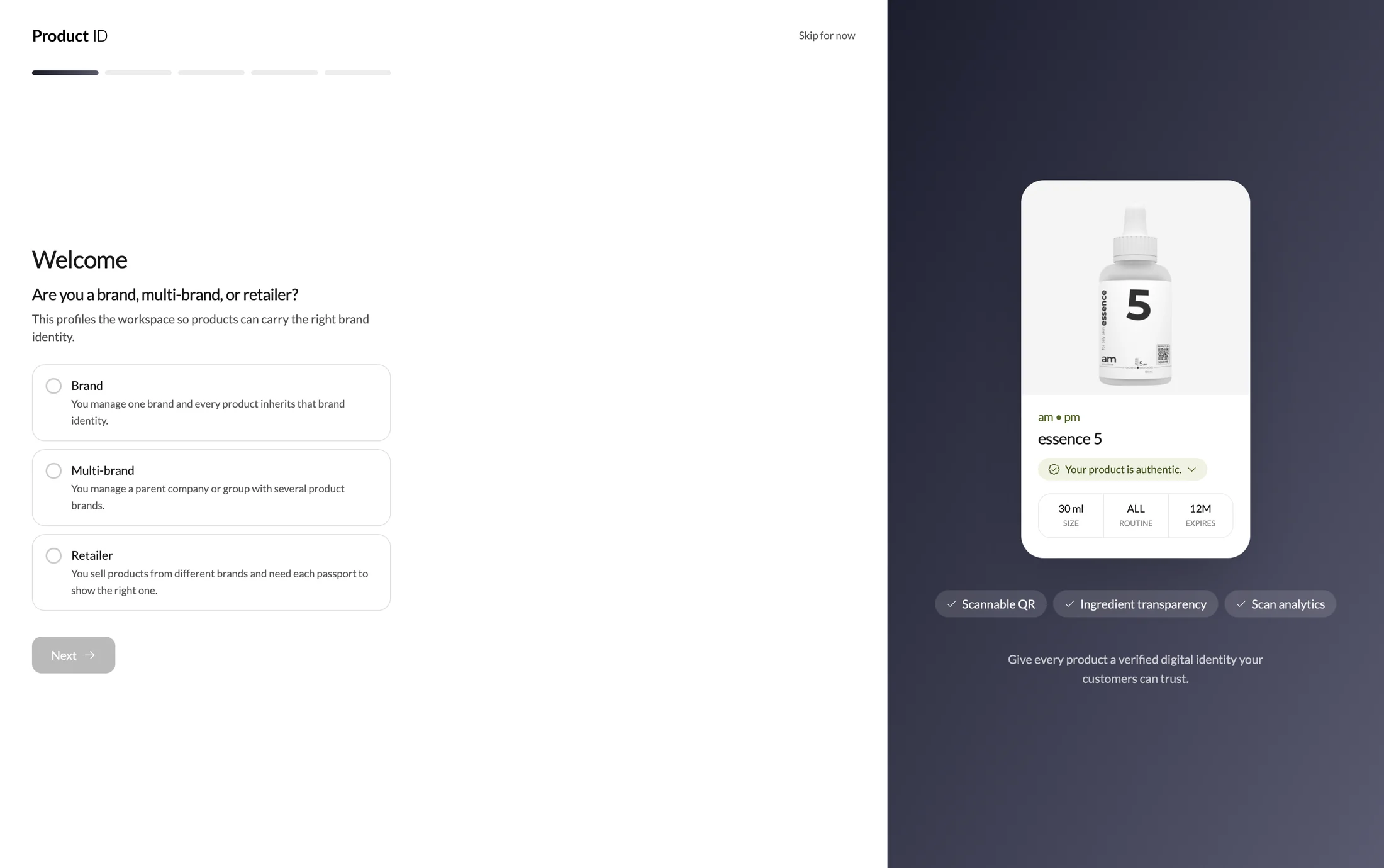
We worked intensively on activation, so users can publish one product and receive a working QR code in minutes.
We implemented sample data, manual data importing, wizard, marketplace, and early self service monetization experiments including pricing and payment directly on the console.
On top of activation, I worked directly with product, engineering, customer success and enterprise clients to connect business needs with usable product behavior.
- Core product: Auth, scannable tables, filters, bulk actions and publishing states, and federated search across marketplaces.
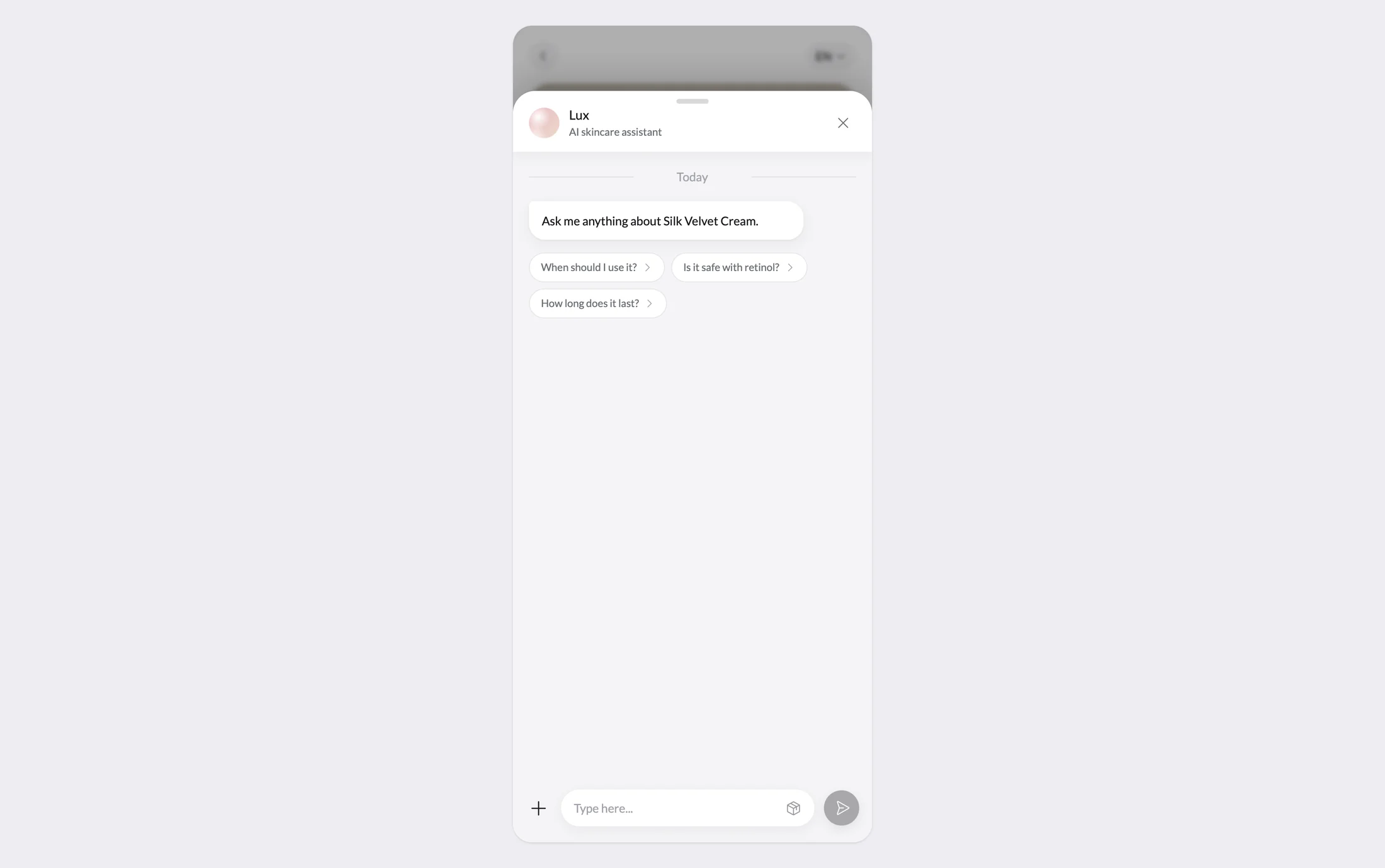
- AI: Assistance grounded in product manuals and structured data
Ask only what changes the product
Business type changed workspace, category and market tailor terminology, defaults and future compliance guidance
We tested an App Clip. The timing was wrong.
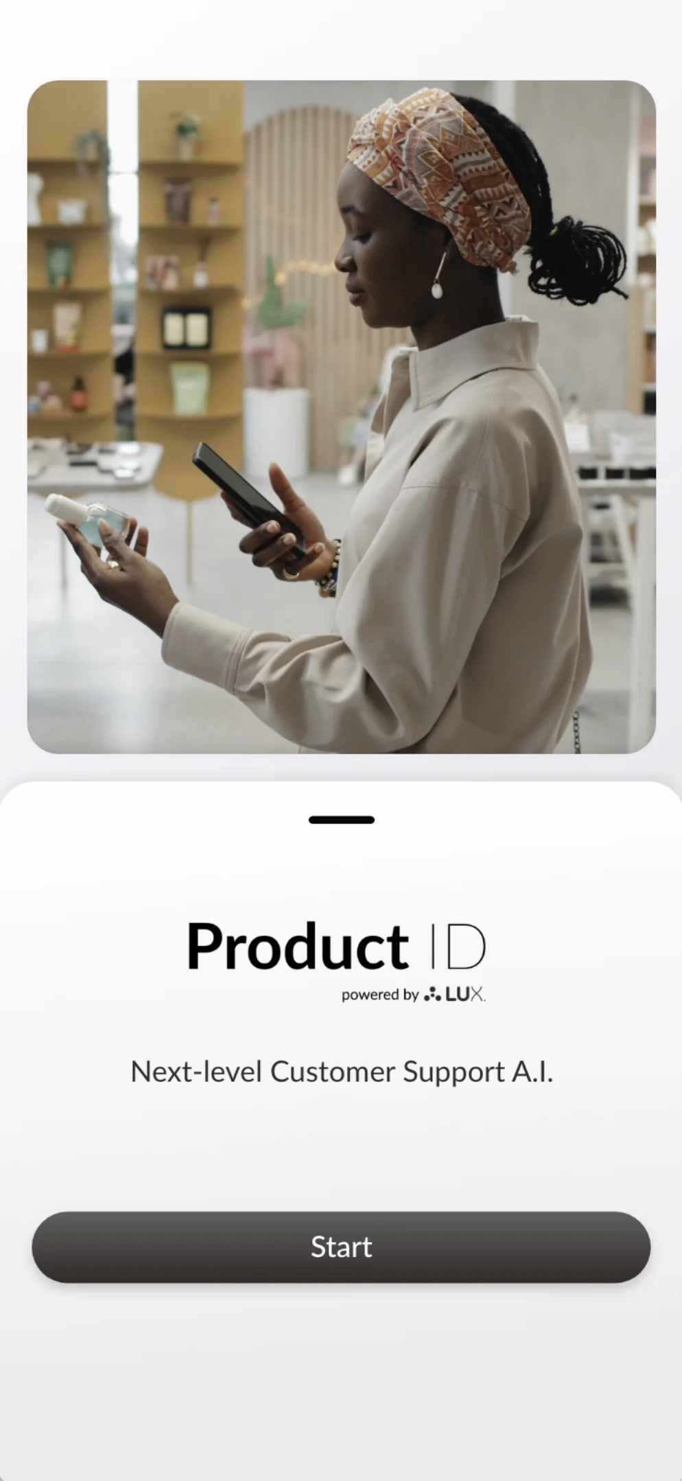
The hypothesis was that a compact branded entry would make repeat scanning faster for customers who already recognised Product ID.
The flow worked. The behaviour around it did not exist yet. People were using Product ID as a temporary scanning utility and most of the cases, white labeled, so every journey still depended on encountering a QR on a product.
We kept mobile web as the primary path and treated the experiment as evidence about repeat value and entry-point dependency.
How success was measured
Time to first answer: Could a shopper identify the product and find a useful answer in seconds.
First product published: Could a brand create, preview, publish and receive a usable QR in its first session.
Catalog maintenance: Did structured records, states and bulk actions hold up for ongoing operations.
Success had to connect both sides: A fast passport nobody could publish at scale was not a working service.
What I learned
Constraints can set the strategy. The QR fixed the device, the posture, the signal and the moment of intent. The phone was not one breakpoint among many, it was the product's defining context.
Using a fixed standard label protected compliance and legibility. Optional blocks give brands real expression without inviting page-builder drift.
Creating a reusable system came from needs that repeated across real client work. The taxonomy earned its place before the interface standardised it.
What you may want to ask next.
The decisions, trade-offs and implementation boundaries behind the case study.
- A QR was only the entry point. The harder problem was turning product data into understanding on a phone, while making the publishing workflow maintainable for real brand teams.
- Mobile first was forced by the only entry point: a QR on the physical product. The context was a phone, one hand, no account, no prior context and potentially weak signal. Desktop was the degenerate case, not the starting canvas.
- The original proposition centered on future compliance. Interviews showed that regulation created urgency but not enough present-day value. The strategy shifted toward useful product understanding for shoppers and a maintainable post-scan channel for brands.
- Generated text should not be the first thing someone reads about ingredients or claims. Static, brand-approved content answered the common questions in a visible hierarchy. LUX sat behind it to handle the long tail without making the core passport depend on conversation.
- Customers had to reach a useful answer quickly, and operators had to publish a first product and receive a usable QR without expert support. Ongoing catalog maintenance was the third quality bar.
- Before the console existed, the service delivered product pages for individual clients through a hands-on process. I mapped that service, clustered recurring needs, then converted the evidence into a finite block taxonomy. Templates are pre-bundled blocks, so a brand never starts from zero.
- Each block had to pass two gates: answer a question shoppers ask at scan time, and map to structured data already held by the product record. Brands fill fields rather than arrange a canvas. The standard label stays fixed, and reordering applies only to optional blocks around it.