I designed the in-app monetization for the Product ID brand console, turning a product-led pricing model into upgrade, checkout, and post-payment flows that helped a service-heavy startup move toward self-serve SaaS, and collect real payments in a regional pilot.
Overview
Brands using the console needed to understand what each plan included, what was locked, and what they'd unlock by upgrading, then pay without leaving the product.
I didn't own pricing strategy. I collaborated with the CEO and Product Director, then translated the Lite, Studio, and Enterprise tiers into the actual product experience.
3 tiers
Plan tiers translated into product UX
Live
Real payments collected in a regional pilot
Lite → Studio
The realistic self-serve upgrade path
The problem
Product ID was moving from a service-heavy startup toward a scalable SaaS model. The console already did a lot, product management, QR codes, analytics, authenticity, AI explanations, but nothing connected those capabilities to pricing or upgrade paths.
The catch: not every feature was equally ready for self-serve. Studio was a realistic upgrade; Enterprise still leaned on custom work and integrations that weren't operational yet.
"How might upgrades feel self-serve inside the product, while staying honest about what was ready and what still needed a custom Enterprise model?"
What I owned
My job was to make monetization understandable inside the actual product, not just to display prices on a page.
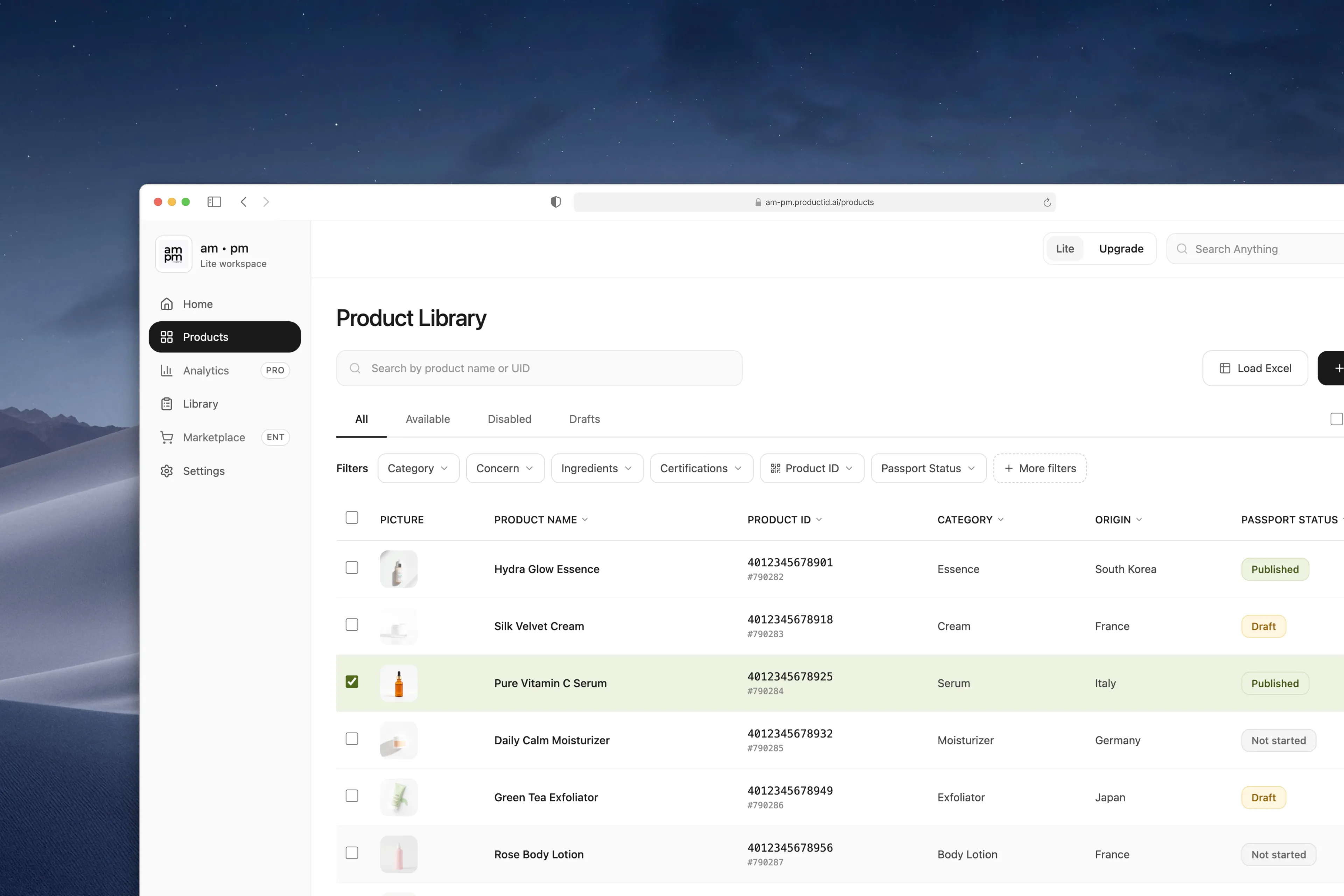
Plan & access UX
Plan visibility in the console, feature gating, gated states, and tier-based access logic.
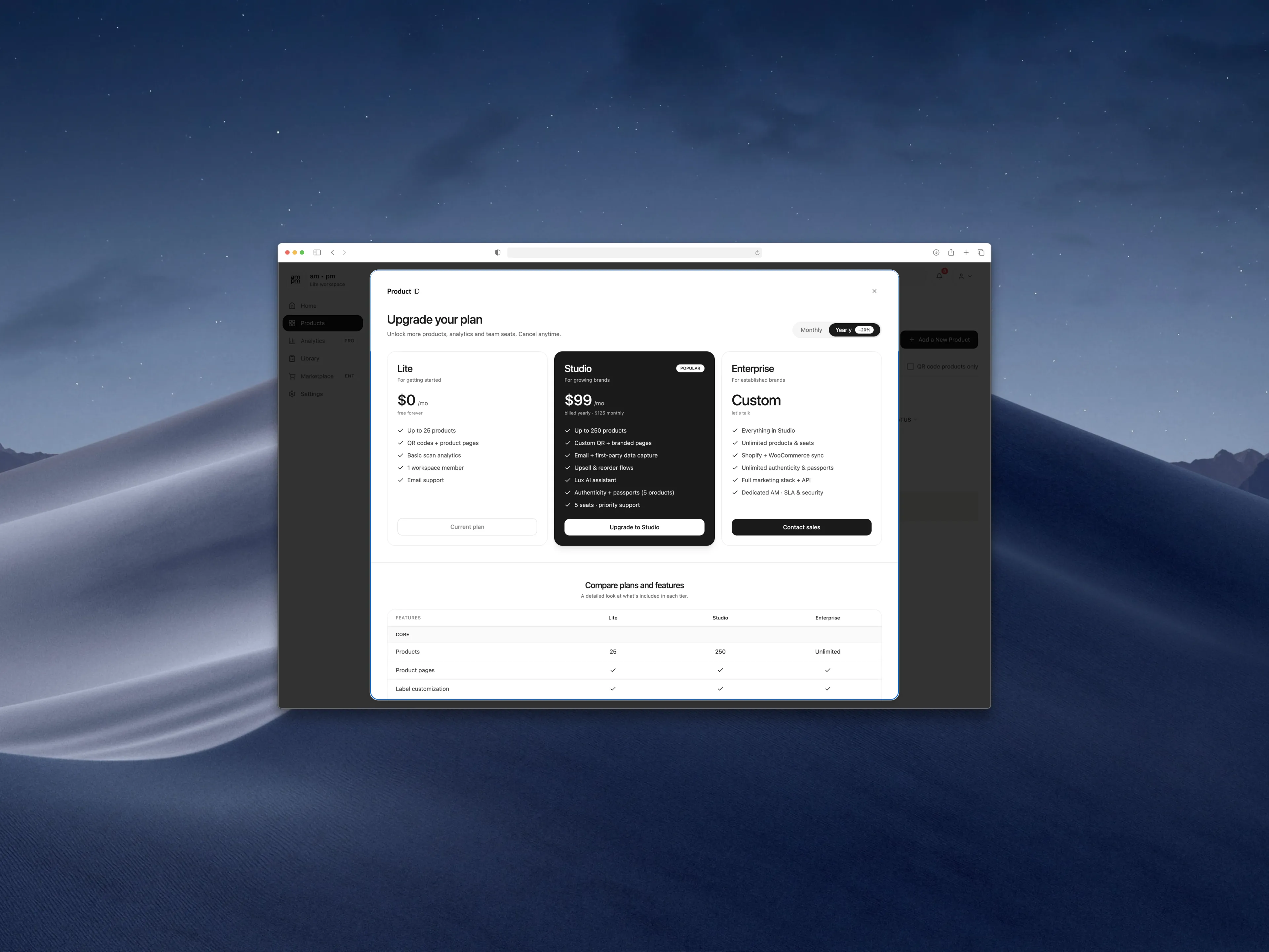
Upgrade & compare
Upgrade entry points, plan cards, and a grouped feature-comparison table.
Checkout & payment
Checkout, payment methods, processing and success states, receipt, and post-upgrade activation.
Roles & learning
Admin / editor / viewer roles, and the analytics direction for upgrade behavior.
Make plan status visible inside the workspace
In a B2B console, plan awareness shapes behavior, it explains why a tool is available, locked, or limited. Users shouldn't have to leave for a billing page to understand it.
So the current plan lives in the console header, and gated capabilities (analytics, marketplace, QR usage, team seats) are marked right where users meet them, so the upgrade reason appears in context.
Tradeoff
Putting plan status in the product surface pulls monetization into the workspace, so it had to stay clear without making the console feel sales-driven.
Plan cards for the quick call, a table for the deep one
Some buyers want a fast answer; others need to compare limits, seats, analytics, support, and security. So plan cards handle the high-level decision, and a detailed table supports closer B2B evaluation across Lite, Studio, and Enterprise.
The upgrade prompt itself appears at the point of need, when someone reaches for a feature their plan doesn't include, where intent is highest.
Tradeoff
A dense table can overwhelm, so it's grouped by feature category to scan by area. And I balanced gating against access, too many locks frustrate while the product is still proving willingness to pay.
Design payment states as trust moments
Checkout is high-friction, people are committing money, so the flow reinforces what they're getting: an order summary that restates the key unlocked benefits, not just a price.
Payment flows live on trust, so I designed clear transactional states, processing, success, receipt with PDF and email, so users always know what's happening and can find proof.
"Payment UX isn't about completing a transaction. It's about reducing anxiety before, during, and after it."
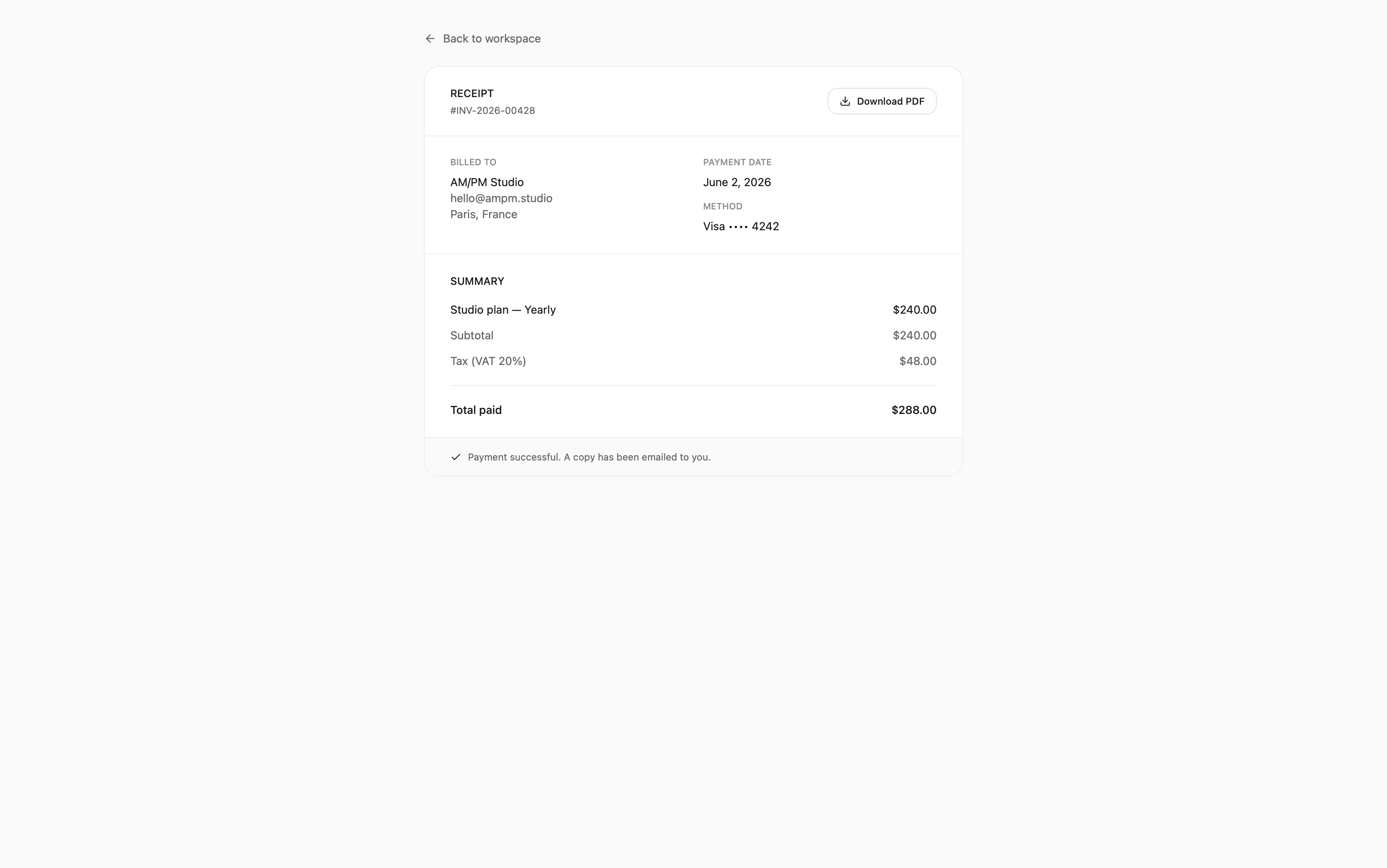
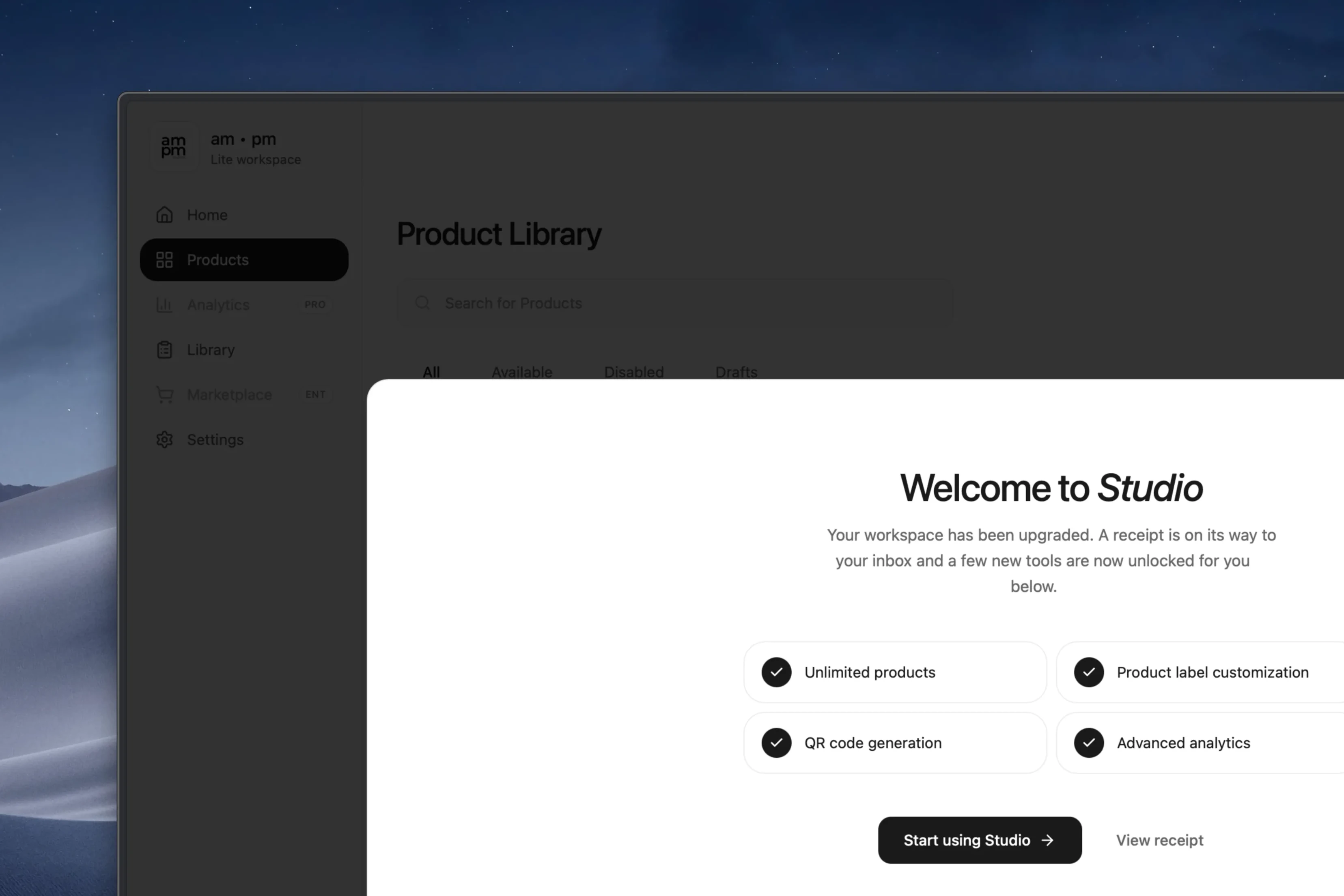
Close the loop with activation
The success state isn't the end of payment, it's the start of using the plan. So the post-upgrade screen explains exactly what was unlocked and points to one clear next action.
It turns a transaction into momentum: pay, see what you gained, start using it.
Ship the honest path: Lite to Studio
Enterprise looked attractive, but several of its capabilities still needed custom setup and support. So we treated Lite to Studio as the real self-serve upgrade and kept Enterprise defined but flagged as partly custom.
We shipped key parts of the upgrade and checkout flow for a Korean pilot, supporting PayPal, Apple Pay, Google Pay, and cards, and collected live payments. Stripe was considered but left out, too heavy for the product stage.
Tradeoff
Enterprise stayed partly aspirational, which made the system less complete but the shipped flow more honest and feasible. Shippable and true beat broad and unproven.